Component Examples
A showcase of all the core components and their variations.
Hero Component
Basic Hero with Image
Example Hero Title
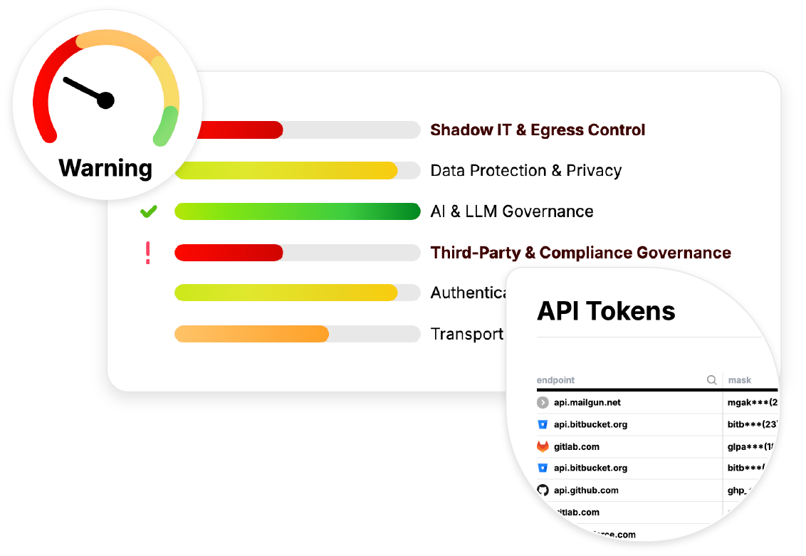
This is an example hero component with an image. It demonstrates the props-based approach for structured content management.

Hero without Image
Hero Without Image
This hero component doesn't include an image, showing how the layout adapts when the image prop is not provided.
Hero without CTA
Hero Without CTA Button
This hero component shows how it looks without a call-to-action button.

MiniUseCase Components
MiniUseCaseWrapper with MiniUseCases
Example Use Cases
Showcasing the MiniUseCase component variations
<::MiniUseCase title="Third-Party Data Risk" description="See exactly what sensitive data you're sending to vendors." icon="shield" url="/use-cases/third-party-data-risk" ctaText="Learn More" /> <::MiniUseCase title="AI Data Exposure" description="Gain visibility into what your teams are sending to external AI APIs." icon="brain" url="/use-cases/ai-data-exposure" ctaText="Learn More" /> <::MiniUseCase title="Compliance Evidence" description="Pass audits with push-button simplicity by generating definitive proof of data residency." icon="check-circle" url="/use-cases/compliance-evidence" ctaText="Learn More" />
Individual MiniUseCase
MiniUseCase without Icon
HeadingIcon Component
Basic HeadingIcon Usage
This is a heading with an icon
Different Heading Levels
H2 Heading with Shield Icon
H4 Heading with Brain Icon
Different Icon Styles
Success State with Check Circle
Quote Icon Example
Usage in Markdown
Available Icons: arrow-down, bluesky, brain, check-circle, check-fat, check, github, linkedin, logo, logogithub, quote, shield, twitter-x, user
Available Icon Sizes: w-4, w-5, w-6, w-7, w-8
Available Icon Colors: Any Tailwind text color class (e.g., text-grape-600, text-green-600, text-red-600)
Step Components
StepWrapper with Steps
How It Works: From Zero to Full Visibility in Minutes
<::Step number="1" title="Deploy With Zero Disruption" description="Install with a single command. No sidecars, no proxies, no code changes." /> <::Step number="2" title="Automatically Discover & Classify" description="Instantly discover every connection and use ML to classify sensitive data (PII, secrets) in the payload." /> <::Step number="3" title="Illuminate Your Entire Network" description="Get a real-time, searchable inventory of every data flow—source, destination, and data classification." />
Individual Step
<::Step number="1" title="Single Step Example" description="This shows how an individual step component looks when used standalone." />
Button Component
Button Variations
Buttons with Icons
Loading Button
Icon Component
Available Icons
Icon Sizes
Input Component
Input Types
Form Component
Contact Form
<::Form class="space-y-4">
Blog Components
Blog Card
Blog Author
<::BlogAuthor name="John Doe" title="Senior Engineer" avatar="/images/team/john.jpg" />
Request Demo Component Example
<::RequestDemo />
Pricing Components
Pricing Table (Desktop)
<::PricingTableData />
Pricing Table (Mobile)
<::PricingTableDataMobile />
Component Usage Guidelines
Best Practices
- Consistent Props: Use consistent prop names across similar components
- Responsive Design: All components should work well on mobile and desktop
- Accessibility: Include proper ARIA labels and keyboard navigation
- Performance: Optimize components for fast rendering and minimal bundle size
Component Hierarchy
- Layout Components: Page layouts and structural components
- Content Components: Hero, Point, Step, etc.
- UI Components: Button, Input, Icon, etc.
- Utility Components: Form, Grid, etc.
Styling System
All components use the design system defined in:
- Tailwind CSS classes
- Custom CSS variables for colors and spacing
- Consistent typography scale
- Responsive breakpoints